
Learning to photograph my craft projects featuring Text(ures) stamps by Lou Collins
Do you know what I find the hardest about blogging and sharing on social media? Taking clear, good photographs. It really is a daily struggle & some days, the struggle can be monumental when doing photography editing.
Recently I’ve been following a few wonderful artists & a few companies, who above being creative, also share their hints and tips about how to get the best shots to show case the project you may have spent hours making.
My subject for this post is the card below …
Recently I’ve been following a few wonderful artists & a few companies, who above being creative, also share their hints and tips about how to get the best shots to show case the project you may have spent hours making.
My subject for this post is the card below …
 stamps by Lou Collins by Lou Sims")
Just a note to say ...
I’m using a wonderful set of stamps from the Text(ures) range by Lou Collins called Sketched Flowers & Typed Sentiments - you can check out the whole Text(ures) range in Craftstash store. This was the original shot I took of my card & it came out okay - well I was happy with it (lol) stamps by Lou Collins by Lou Sims")
… but when I applied some of the “hints & tips” from all the different suggestions, I changed the composition slightly, lighting was improved further by taking photo outside & changed the props around too, the photography editing became easier.
 stamps by Lou Collins by Lou Sims")
Not 100% where I want to be but that is down to the fact that I was holding my phone rather than using a tripod for some of the closer shots. That was one of the interesting points that I read, about holding our phones straight - we think we do but only when we look back, we realise wasn’t quite the case (lol).
How did I make my card?
I began by creating my background using the Typewriter Reflection" stamp set with distress oxides. I have stamped each of the floral elements from Sketched Flowers and cut them out. Now if cutting is not your thing, the stamp sets do come with matching dies (links at bottom of this post). I’ve coloured some of the flowers with oxides & then added Glossy Accents Crackle for an added textural layer. I also did the same to the flowers I have left as uncoloured.
For the type writer, (called Typed Sentiments), I’ve actually coloured it using distress embossing glazes (cracked pistachio & kitch flamingo) & love how it has come out. It was then just a case of adding all the different parts on top of each ...

Places to go for photography editing ideas
Debi Adams
Love this ladies work and she has a fabulous blog where she shares hints and tips about taking fabulous photographs. I became introduced to Debi via Seth Apter and her focus on his team, was to show how to capture our projects showing all the layers etc. I’m a visual person, so seeing the photograph examples alongside the description really helps get the information/ideas inside my head. You can check out Debi HERELife Handmade Podcast
Scrapbook.com over the last year have a great selection of craft based podcasts covering a whole host of topics … one being photography. It was really informative and all based around taking photos on your mobile phones - yippppeeeeee! Although the podcasts are about printing your photos off eventually, the tips are easily applied to social media photos too.Craft Labrador
Again as a visual learner, loved seeing how photos were “staged” & also seeing how a curved background worked better than placing against harsh “butted up” edges. Check out the post HERE.Etsy
I’m not sure why I’m shocked at mentioning Etsy but when you think how a photograph can influence us, it actually is quite logical that they give hints & tips about taking good photos of your craft projects. You can see all the tips HERE.What next?
This is definitely an area I want to keep improving upon and think my next learning curve will be getting to know what all the different camera settings mean & how they work together. Sadly I've become reliant on my phone or camera doing all that for me but then when the photos look pants, cannot figure out how or why ...! Also gotta look more in to the "rules of thirds" but not sure how it will work with craft projects ... 😕
If you can recommend any good sites or people to follow, please do share them.
So what's your photography challenge today? I've already got a pile of projects waiting to be photographed and as the light outside is ace today, can't wait to get started.
Until next time ... stay safe & well,
Lou
x x x
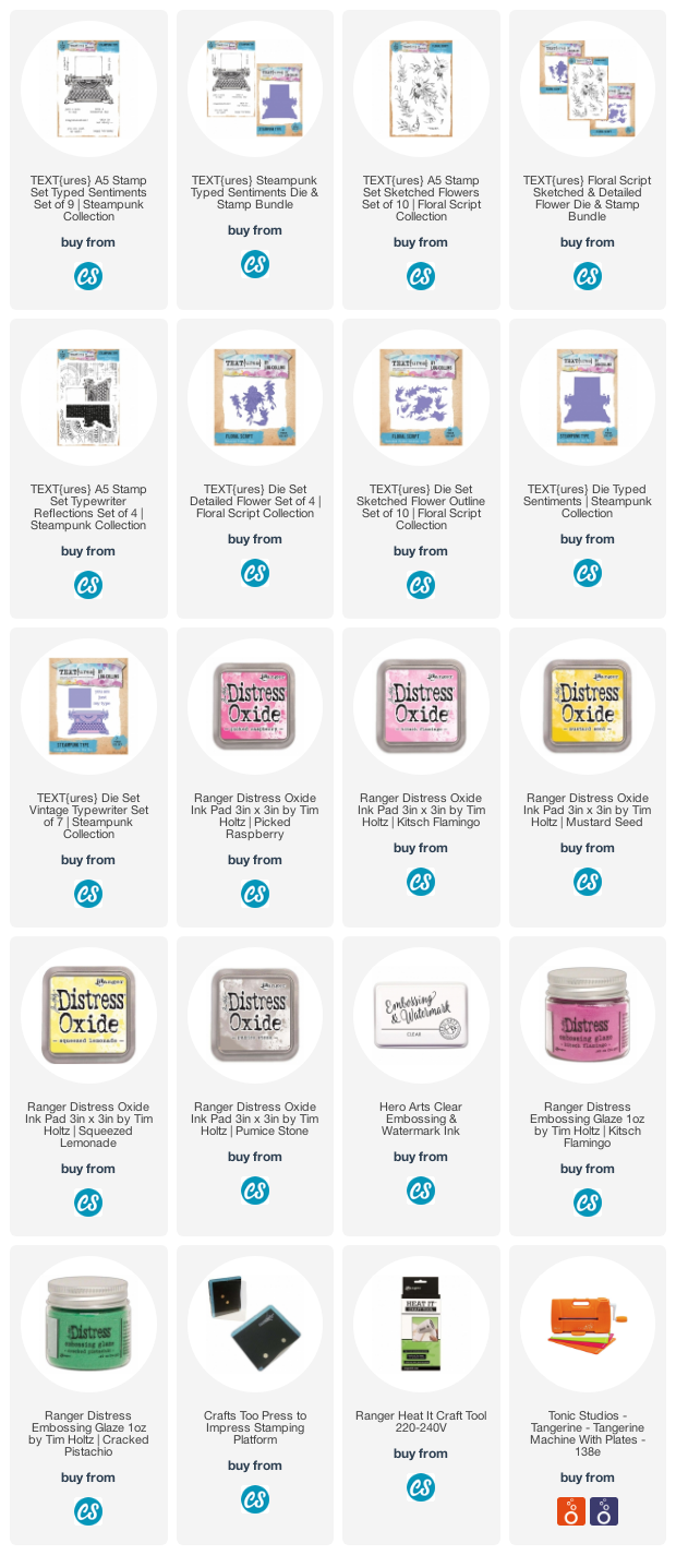
SUPPLIES
If you want to find out about the products I have used, click on the shop link(s)/icon below. Affiliate links are used at no cost to you. Affiliate disclosure can be found here.
Thank you so much for your continued support.
Thank you so much for your continued support.
 stamp range by Lou Collins by Lou Sims")
Comments
Susan Hornby