
One Stamp Set, Three Looks: A Guide to Changing Colours
Did you know that you can completely change the look and feel of a card just by changing the colors you use? In this blog post, I'll show you how a single stamp set can create an array of stunning creations by simply changing the background colours!
.png)
See below how I've taken one idea but created three different cards.
- - - - - 💙 - - - - -
One stamp set, one idea but change the colour!
Taking the main focal image from Shady Designs Frame By Frame stamp set, I wanted to create a quick card idea by show by changing the background colour, you can create softer or more dramatic looks. To choose your colours, create quick swatches of your ideas and see what works together and what doesn't. For me, when creating different styles but with the same theme, I only get out the products needed for that card. I've learned the hard way that if I got everything out, I'm bound to pick up the wrong ink pad!
Idea #1: Soft & gentle colour scheme
Materials:
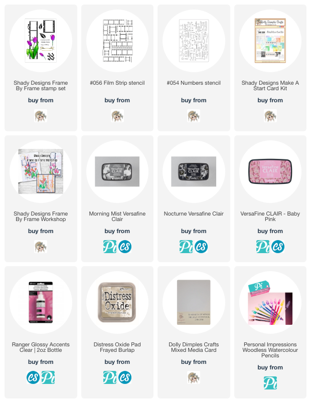
Shady Designs Film Strip stencil
Distress oxides: kitsch flamino & antique linen
Card, pads & glue from stash
.png)
- Using Shady Designs Film Strip & Numbers stencils, I made a soft layered background with the oxide inks. Using the same oxide colours, I stamped randomly the diamond background stamp.
- Next using Versafine Clair Morning Mist, I stamped the image on to the background, extending the film strip design to cover the whole panel. This is easily done by only inking the open ends of the film strip and lining up the design.
- On a separate piece of card, I re-stamped the image in Versafine Morning Mist, coloured the flowers with the Woodless Water Colour Pencils & cut them out once dry. I also stamped the banner & a sentiment too. I added these to my panel with 3D foam pads.
.png)
- As a finishing touch, I stamped the diamond background stamp in Versafine Clair Baby Pink & Nocturne cutting away the diamond elements. Yes this could seem "faffy" but I thought they made the perfect embellishments.
- - - - - 💙 - - - - -
Idea #2: Vintage Grunge!
Materials:
.png)
- This card design has the same background process as the first card - idea #1: soft & gentle colour scheme to recreate the background stages. The only difference has been changing the ink colours for the background: frayed burlap & antique linen
- Rather than using the diamond background stamp as embellishments, I have kept it in the background and highlighted one or two of the shapes with glossy accents.
- The main floral image was again coloured with my Personal Impressions Woodless Watercolour Pencils.
- - - - - 💙 - - - - -
Idea #3: Multi layered over stamping technique
Versafine Clair Nocturne
Card, pads & glue from stash
.png)
- For this card, I have used a pre-designed background (Shady Designs Make A Start Card Kit) and found the centre point on each of the short sides of the background and drew a very soft pencil line.
- Using the pencil line as my guide, I stamped the image twice so that they joined/lined up against the pencil guide line - I hope that makes sense. To stop any over stamping, I placed a piece of scrap paper against the outside edge before stamping my next film strip.
- I coloured all images with my Personal Impressions Woodless Water Colour pencils.
.png)
- On a separate piece of card, I stamped out the part with the tulip images, coloured as the background ones & cut them out. These were then layered on top with 3D foam. This then disguises where the two film strips met and makes the design more cohesive.
.png)
- In keeping with the other two card ideas, I have used the same sentiment placing it (roughly) in the same position.
- - - - - 💙 - - - - -
Introducing the Frame By Frame Set:
- The Shady Designs Frame By Frame stamp set is an A5 clear stamp set with one main focal image, separate film cell, accessory images, background stamp & 3 sentiments which fit inside the banner.

- When I designed the Frame By Frame stamp set, I wanted it to make quick projects whether that be for cardmaking or journaling. It was also important it could be vintage, modern, playful - everything us creatives want without having to over think.
- - - - - 💙 - - - - -
It's amazing how quickly you can create a different feel for your cards just by changing the color palette. I hope this post inspires you to experiment with your own supplies to get more use out of your favorite stamp sets!
Many thanks for taking the time to visit my blog today and each visit is genuinely appreciated.
Until next time, take care,
Lou
xxx
Comments